CSSで作るローディングアニメーション10選
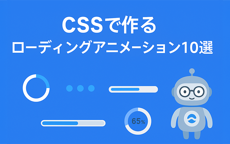
ページやコンポーネントの読み込み時に使える、CSSだけで作るローディングアニメーションを10種類まとめました。軽量で使い回しやすい実装を中心に、アクセシビリティとパフォーマンスの注意点も解説します。
目次
1. シンプルスピナー(円形スピン)
最も基本的なスピナー。軽量でどこでも使える定番。
<div class="spinner"></div>

<style>
.spinner{
  width: 40px;
  height: 40px;
  border: 4px solid rgba(0,0,0,0.08);
  border-top-color: #3498db;
  border-radius: 50%;
  animation: spin 0.9s linear infinite;
  display:inline-block;
}
@keyframes spin {
  to {
    transform: rotate(360deg);
  }
}

/* prefers-reduced-motion に配慮 */
@media (prefers-reduced-motion: reduce){
  .spinner {
    animation: none;
    opacity: 0.8;
  }
}
</style>補足:prefers-reduced-motion(動き控えめ設定)について
prefers-reduced-motion は、OSやブラウザの設定で「アニメーションを減らす/無効にする」を選んだユーザーを尊重するためのCSSメディアクエリです。 視覚的な動きに不快感を覚えたり、めまいや注意散漫になりやすいユーザーが存在するため、アニメーションのあるUIでは必ず配慮を入れてください。
2. ドットパルス(点が膨らむ)
小さな点が順に膨らむシンプルなパターン。テキストの横などに最適。
<div class="dot-pulse">
  <span></span><span></span><span></span>
</div>

<style>
.dot-pulse {
  display: inline-flex;
  gap: 8px;
  align-items: center;
}
.dot-pulse span {
  display: block;
  width: 10px;
  height: 10px;
  border-radius: 50%;
  background-color: #2d9cdb;
  transform-origin: center;
  animation: dotPulse 0.9s cubic-bezier(.2,.6,.2,1) infinite;
}
.dot-pulse span:nth-child(2) {
  animation-delay: 0.12s;
}
.dot-pulse span:nth-child(3) {
  animation-delay: 0.24s;
}
@keyframes dotPulse {
  0%{ transform: scale(1); opacity:0.6; }
  50%{ transform: scale(1.6); opacity:1; }
  100%{ transform: scale(1); opacity:0.6; }
}
@media (prefers-reduced-motion: reduce) {
  .dot-pulse span {
    animation: none;
    opacity: 0.85;
    transform: none;
  }
}
</style>3. バウンシングドット(3点の跳ねるアニメ)
短い遅延でリズミカルに跳ねるドット。ロード待ちの視覚的リズムに。
<div class="bouncing-dots">
  <span></span><span></span><span></span>
</div>

<style>
.bouncing-dots {
  display: inline-flex;
  gap: 8px;
  align-items: flex-end;
  height: 20px;
}
.bouncing-dots span {
  width: 8px;
  height: 8px;
  background-color: #ff6b6b;
  border-radius: 50%;
  animation: bounce 0.9s cubic-bezier(.28,.84,.42,1) infinite;
}
.bouncing-dots span:nth-child(2) {
  animation-delay: 0.12s;
}
.bouncing-dots span:nth-child(3) {
  animation-delay: 0.24s;
}
@keyframes bounce {
  0%{ transform: translateY(0); }
  50%{ transform: translateY(-10px); }
  100%{ transform: translateY(0); }
}
@media (prefers-reduced-motion: reduce) {
  .bouncing-dots span {
    animation: none;
  }
}
</style>4. ローディングバー(インジケータ)
幅いっぱいに伸びるバー型のインジケータ。プレースホルダ読み込みに合う表現。
<div class="loading-bar">
  <div class="loading-bar__inner"></div>
</div>

<style>
.loading-bar {
  width: 260px;
  height: 6px;
  background-color: rgba(0,0,0,0.06);
  border-radius: 6px;
  overflow: hidden;
}
.loading-bar__inner {
  width: 100%;
  height: 100%;
  background: linear-gradient(90deg, #6a11cb, #2575fc);
  animation: barMove 1.2s cubic-bezier(.2,.6,.2,1) infinite;
}
@keyframes barMove {
  0%{ transform: translateX(-100%); }
  50%{ transform: translateX(20%); }
  100%{ transform: translateX(100%); }
}
@media (prefers-reduced-motion: reduce){
  .loading-bar__inner {
    animation: none;
  }
}
</style>5. スケルトンシマー(骨組みプレースホルダ)
コンテンツ読み込み中のプレースホルダ。実用性が高くUXも良好。
<div class="skeleton">
  <div class="skeleton__thumb"></div>
  <div class="skeleton__lines">
    <div></div><div></div><div></div>
  </div>
</div>

<style>
.skeleton {
  display: flex;
  align-items: flex-start;
  gap: 12px;
  width: 320px;
}
.skeleton__thumb {
  width: 100px;
  height: 80px;
  background-color: #e6e6e6;
  border-radius: 6px;
}
.skeleton__lines div {
  width: 220px;
  height: 12px;
  background: linear-gradient(90deg, #e6e6e6, #f5f5f5, #e6e6e6);
  background-size: 200% 100%;
  border-radius: 6px;
  margin-bottom: 8px;
  animation: shimmer 1.2s linear infinite;
}
@keyframes shimmer {
  0% { background-position: 200% 0; }
  100% { background-position:-200% 0; }
}
@media (prefers-reduced-motion: reduce) {
  .skeleton__lines div { animation: none; }
}
</style>6. デュアルリング(2重リング)
同心円が反時計回り/時計回りに動くことでリッチな表現。
<div class="dual-ring"></div>

<style>
.dual-ring {
  position: relative;
  display: inline-block;
  width: 48px;
  height: 48px;
}
.dual-ring::before,
.dual-ring::after {
  content: '';
  position: absolute;
  inset: 0;
  border: 4px solid rgb(204, 204, 204, 0.2);
  border-radius: 50%;
}
.dual-ring::before {
  border-top-color: #ffb86b;
  animation: spin 1.1s linear infinite;
}
.dual-ring::after {
  border-bottom-color: #6a11cb;
  scale: 0.75;
  animation: spin 1.6s linear reverse infinite;
}
@keyframes spin {
  to { transform: rotate(360deg); }
}
@media (prefers-reduced-motion: reduce) {
  .dual-ring::before,
  .dual-ring::after { animation:none; }
}
</style>7. 回転角ブロック(四角が回る)
四角形が回転して入れ替わるアニメ。少しモダンな印象に。
<div class="rotating-squares">
  <span></span><span></span><span></span><span></span>
</div>

<style>
.rotating-squares {
  position: relative;
  display: inline-block;
  width: 48px;
  height: 48px;
}
.rotating-squares span {
  position: absolute;
  inset: 0;
  width: 18px;
  height: 18px;
  background-color: #1abc9c;
  margin: 0 auto;
  transform-origin: center;
  animation: rotateSquare 1.2s cubic-bezier(.2, .8, .2, 1) infinite;
}
.rotating-squares span:nth-child(1) {
  transform: translate(-12px, -12px);
  animation-delay: 0s;
}
.rotating-squares span:nth-child(2) {
  transform: translate(12px, -12px);
  animation-delay: 0.15s;
}
.rotating-squares span:nth-child(3) {
  transform: translate(12px, 12px);
  animation-delay: 0.3s;
}
.rotating-squares span:nth-child(4) {
  transform: translate(-12px, 12px);
  animation-delay: 0.45s;
}
@keyframes rotateSquare{
  0%{ transform: scale(0.6) rotate(0deg); opacity:0.6; }
  50%{ transform: scale(1.05) rotate(180deg); opacity:1; }
  100%{ transform: scale(0.6) rotate(360deg); opacity:0.6; }
}
@media (prefers-reduced-motion: reduce) {
  .rotating-squares span { animation:none; }
}
</style>8. 円形プログレス(決まった割合の表示向け)
決まった進捗を表示するのに使える円形の疑似プログレス(CSSのみで簡易的に表現)。
<div class="circle-progress" data-progress="65"><span>65%</span></div>

<style>
/* シンプルな見せ方:conic-gradient を利用(対応ブラウザ要確認) */
.circle-progress {
  display: inline-grid;
  width: 80px;
  height: 80px;
  border-radius: 50%;
  place-items: center;
  background: conic-gradient(#3498db calc(var(--p, 65) * 1%), rgba(0, 0, 0, 0.08) 0);
  --p: 65;
  font-weight: 600;
  color: #222;
}
.circle-progress span {
  font-size: 14px;
  background-color: #fff;
  padding: 6px 8px;
  border-radius: 6px;
}
/* JSで data-progress を CSS 変数に反映する場合(任意) */
</style>

<script>
document.querySelectorAll('.circle-progress').forEach(function(el){
  var p = el.getAttribute('data-progress') || 0;
  el.style.setProperty('--p', p);
});
</script>9. 波形ローダー(横に流れる波)
幅いっぱいに横へ流れる波。背景ローディングやセクション読み込みに向く。
<div class="wave-loader"></div>

<style>
.wave-loader {
  position: relative;
  width: 100%;
  max-width: 320px;
  height: 10px;
  border-radius: 999px;
  background: linear-gradient(90deg, rgba(0, 0, 0, 0.4), rgba(0, 0, 0, 0.2));
  overflow: hidden;
}
.wave-loader::before {
  content: '';
  position: absolute;
  inset: 0;
  background: linear-gradient(90deg, rgba(255,255,255,0), rgba(255,255,255,0.35), rgba(255,255,255,0));
  transform: translateX(-100%);
  animation: wave 1.1s linear infinite;
}
@keyframes wave {
  100% { transform: translateX(100%); }
}
@media (prefers-reduced-motion: reduce) {
  .wave-loader::before{ animation:none; }
}
</style>10. パルスハロー(周囲がふわっと光る)
要素の周りがゆっくり拡大して消える。注目させたいときに有効。
<div class="pulse-halo"></div>

<style>
.pulse-halo {
  position: relative;
  display: inline-block;
  width: 48px;
  height: 48px;
  border-radius: 50%;
  background-color: #6a11cb;
}
.pulse-halo::after {
  content: '';
  position: absolute;
  inset: 0;
  border-radius: 50%;
  box-shadow: 0 0 0 6px rgba(106, 17, 203, 0.18);
  animation: halo 1.4s ease-out infinite;
}
@keyframes halo {
  0%{ transform: scale(1); opacity:1; }
  100%{ transform: scale(1.9); opacity:0; }
}
@media (prefers-reduced-motion: reduce) {
  .pulse-halo::after{ animation:none; opacity:0.6; }
}
</style>アクセシビリティと実装のポイント
- prefers-reduced-motion を必ず用意して、アニメーションをオフにできるようにする。
- 読み込みが長時間になる場合、ARIAで状態を伝える(例:
role="status" aria-live="polite")とスクリーンリーダーへ通知される。 - アニメーションはなるべく
transformとopacityに限定し、レイアウト再計算(reflow)を避けることでパフォーマンスを保つ。 - モバイルでは複雑なアニメーションでバッテリーや描画負荷が上がるため、必要最低限の表現に留める。
- 色やコントラストはアクセシビリティ配慮(色覚多様性)を考慮する。重要な情報は色以外でも識別できるようにする。
ワンポイント
ローディングは“待ち”の時間をどう使うかの工夫。短く分かりやすいアニメで安心感を与えよう!
まとめ
ここで紹介した10種はすべて軽量で使い回しやすい実装です。用途(小さなインジケータ、ページ全体、プレースホルダ)に合わせて選び、アクセシビリティとパフォーマンスに配慮して実装してください。必要ならサンプルの配色バリエーションやSVG版の実装、複数同時スタック表示の拡張も作成します。